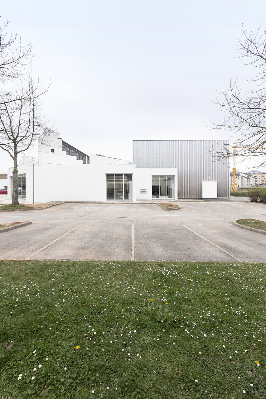
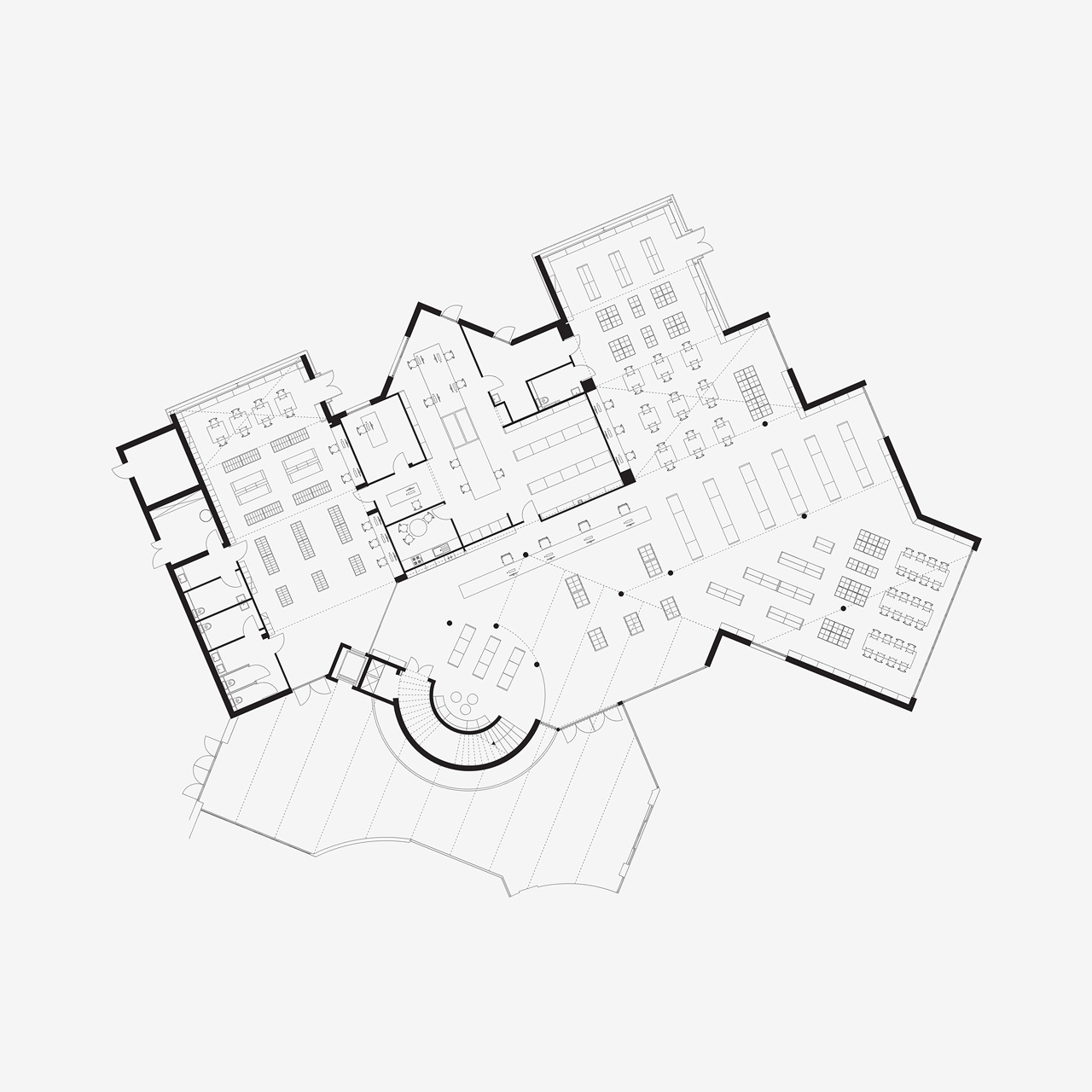
The program for the “Onet-le-Château media library” project in Aveyron, in the heart of rural France, was intended to bring a well-used library into compliance with current standards. The client was concerned with the intrinsic quality of the spaces, supported by simple and rational questions, without preconceptions. We recognised ourselves in this approach to architecture, which was our common ground. Today, after work that was balanced between client and architect, the media library attests to this shared commitment to the city.
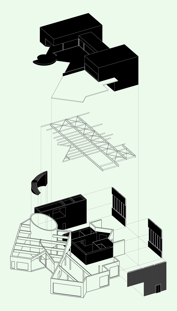
The renovation of the media library draws its strength from an analysis of the existing structure and its possibilities, as it leads to a re-creation. The client wanted simultaneously to open the media library up to new uses and meet technical (obsolescence of the existing structure, and lack of comfort) and spatial requirements (additional space, varied distribution).
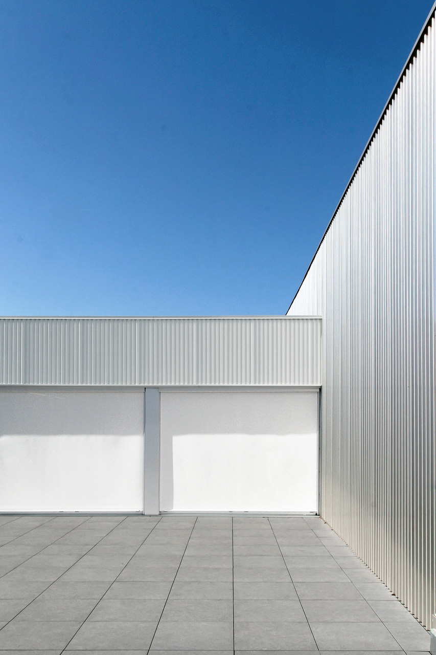
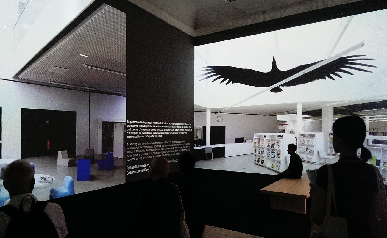
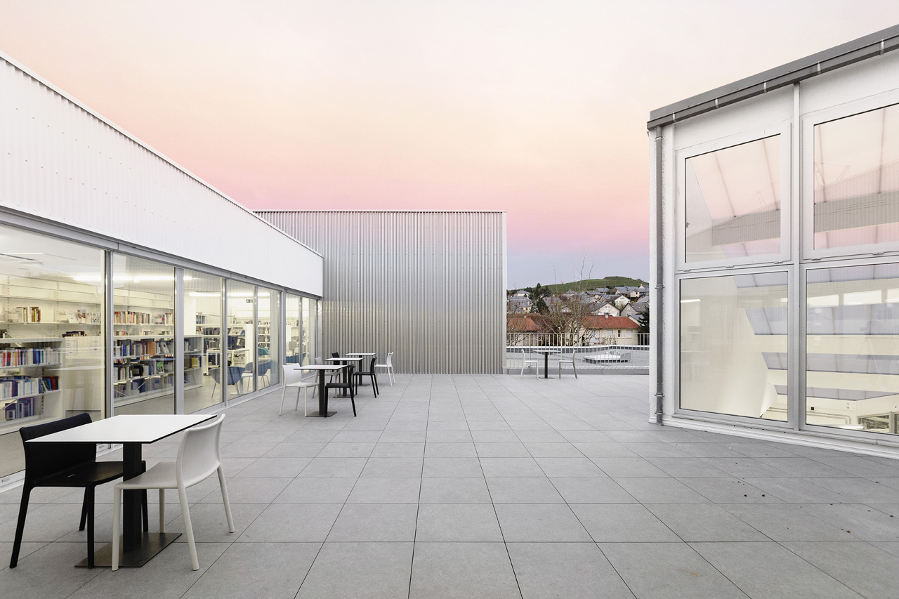
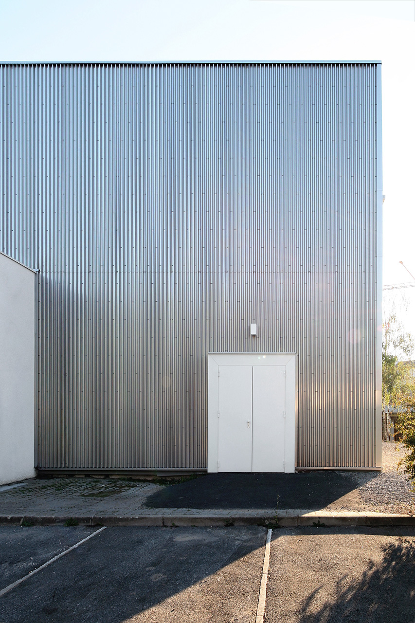
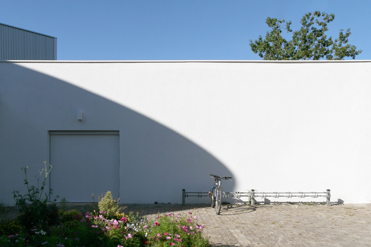
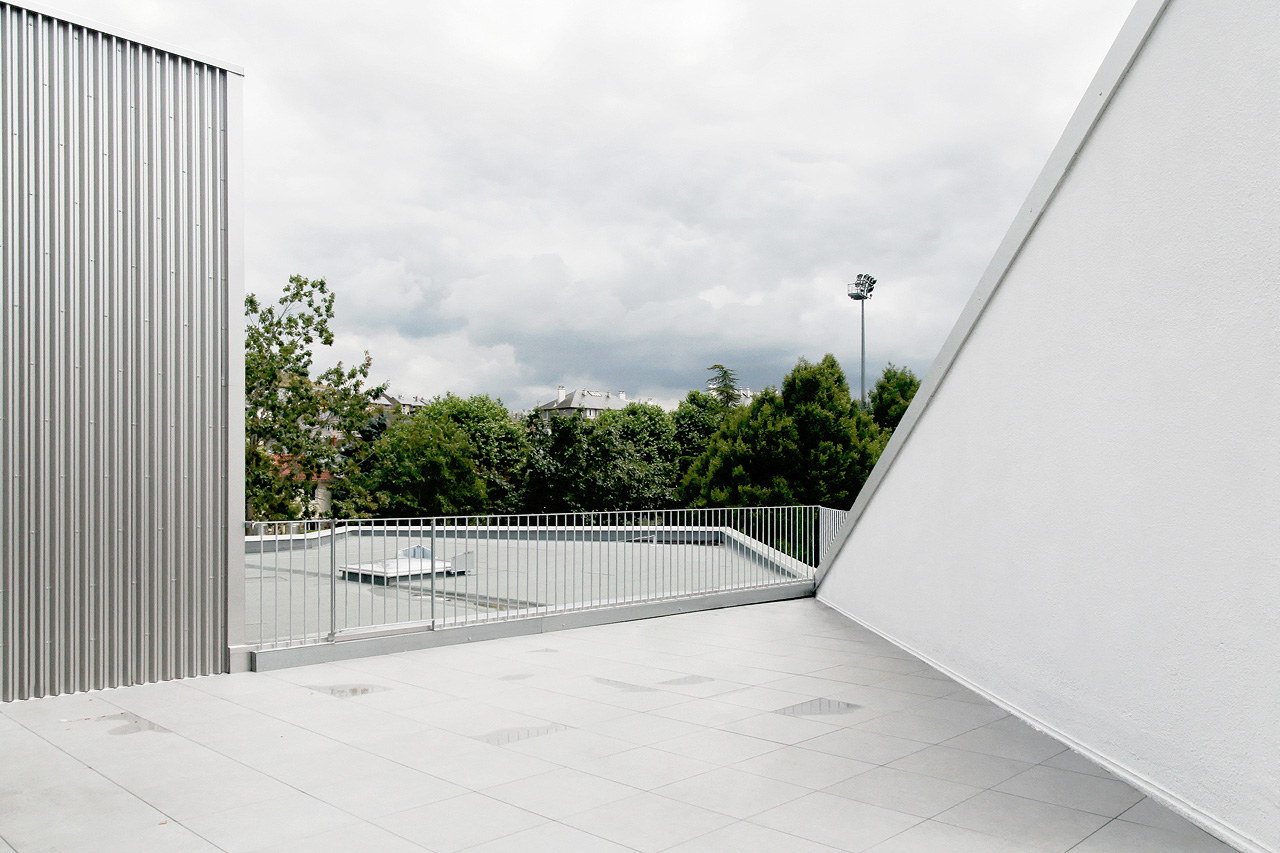
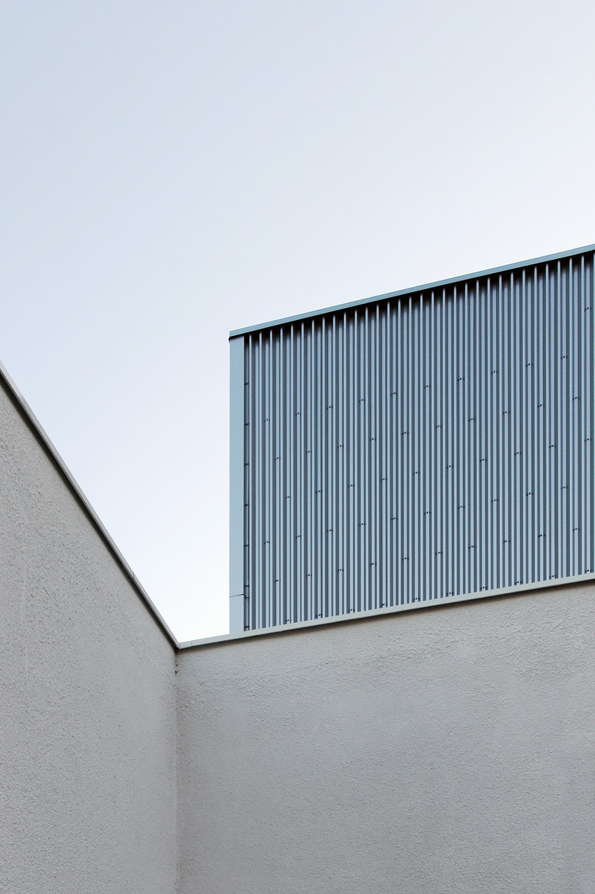
By starting with the indispensable renovation of the roof, the project completely re-structured the program and expanded it over two levels while maintaining the existing footprint. This design helped on the one hand create an entry on the upper floor, open to a sunny patio, and on the other, to create significant additional space without encroaching upon the parking area, which is indispensable in this little rural village. From the exterior, the reading of the project is clear, identifiable by the two new stainless steel clad volumes, which are double height with mezzanines.
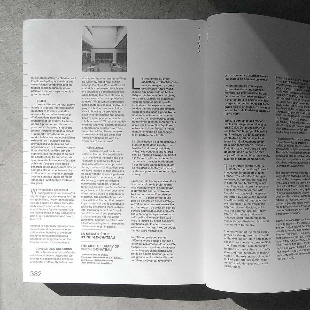
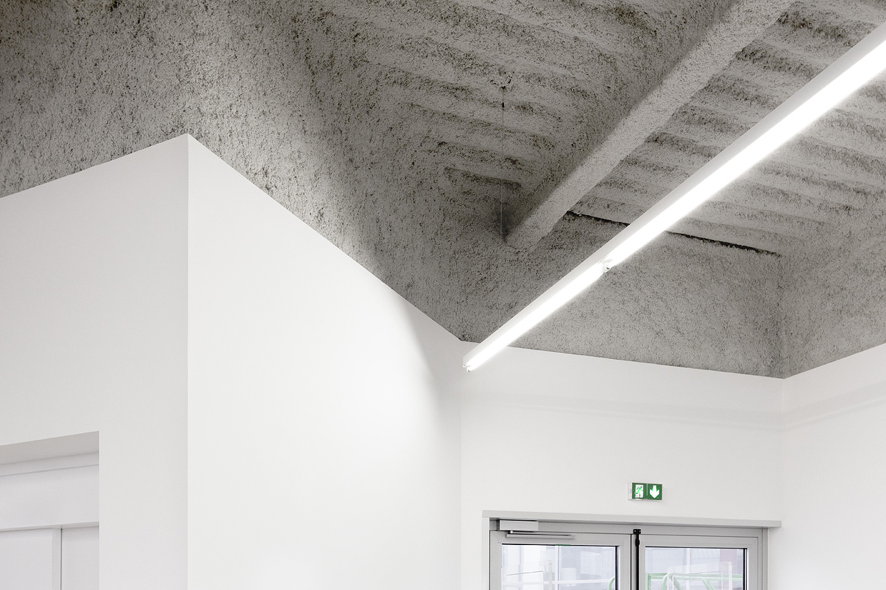
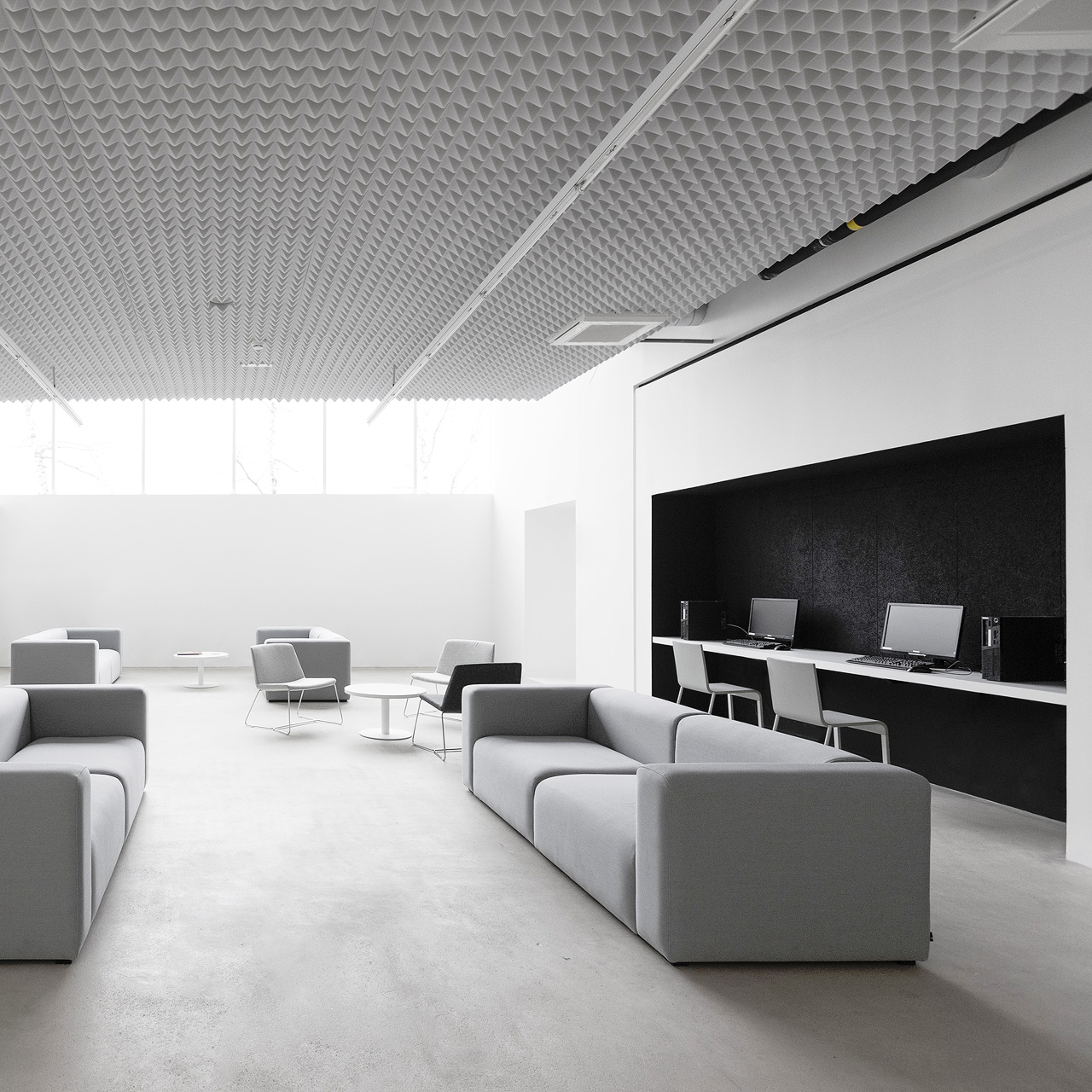
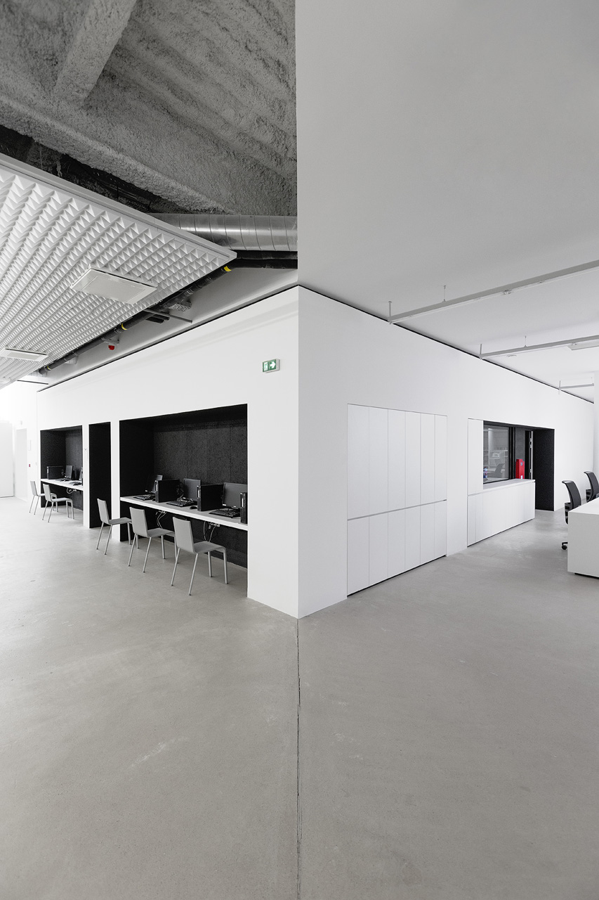
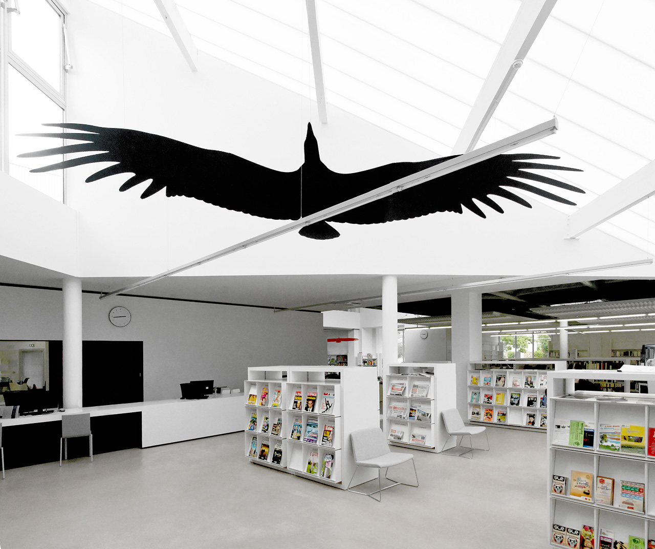
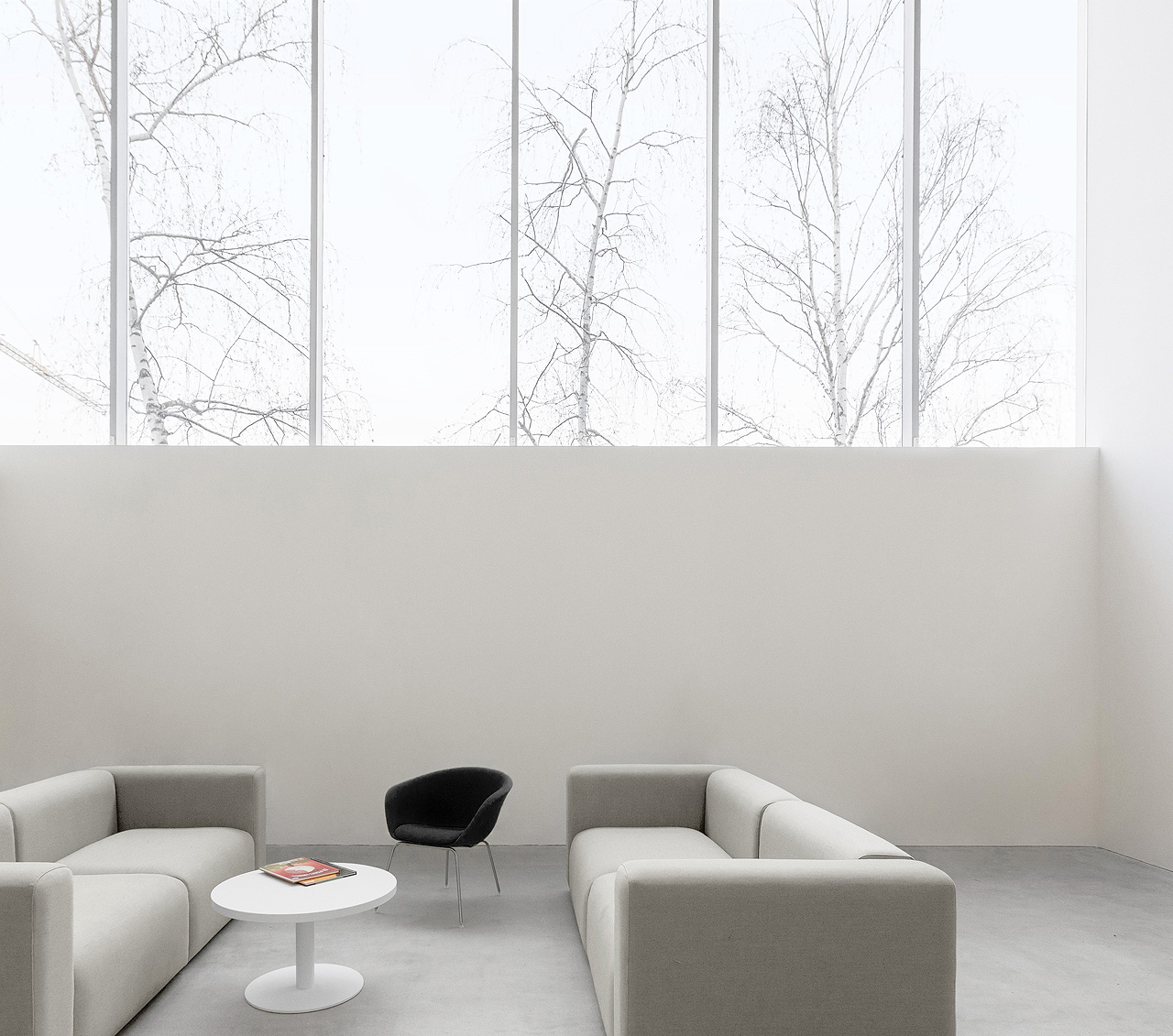
A shared reflection on the various types of uses led to creating a variety of interior spaces, with changing climate or lighting qualities. The double height areas generate continuous light of 950 lux, while some alcoves, with black sound absorbing treatments, insulate the user from the environment.
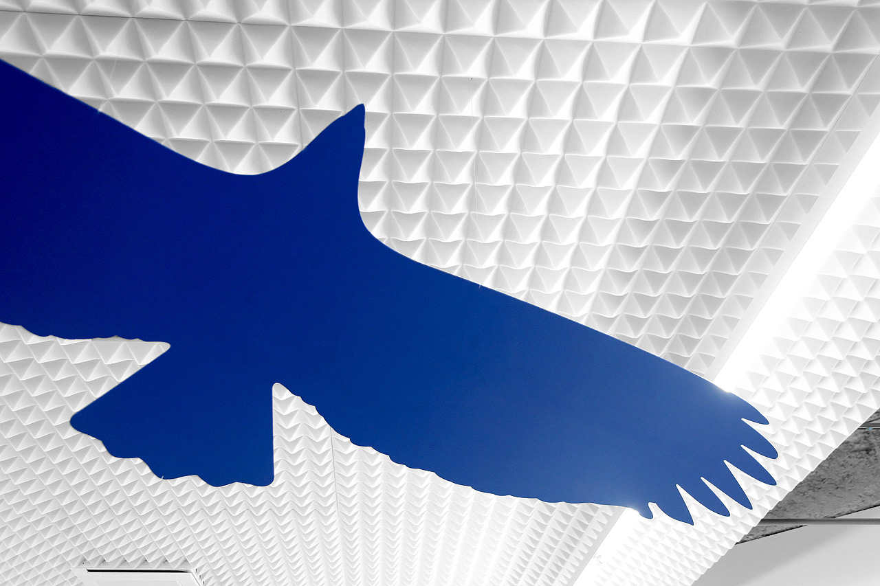
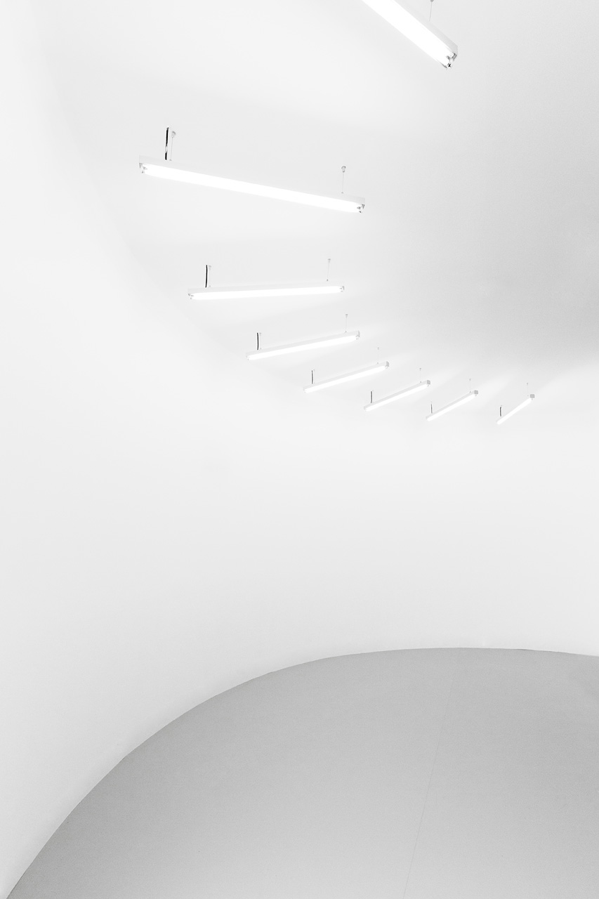
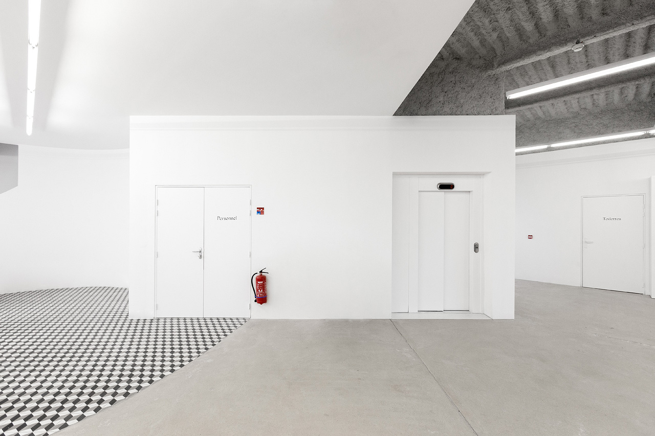
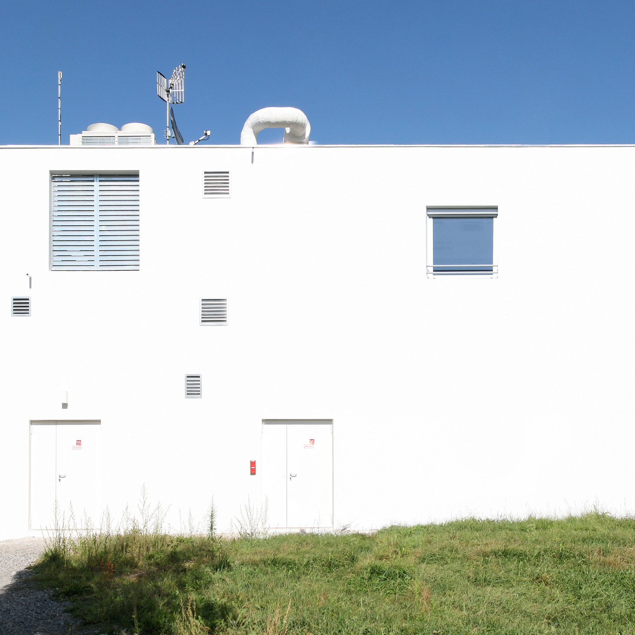
The architecture was intended to suggest little and to be extremely neutral. The white paint unifies the whole and seems the appropriate choice for staff and users. The media library has a strong system of signs from artist and graphic designer Pierre Vanni, thanks to the artistic 1% (construction and renovation projects for public buildings are required to devote 1% of the pre-tax cost of construction to the purchase of artwork).
Lastly, the managers’ confidence in a young team and the intimacy of the exchanges helped the project succeed. Humility and intelligence created true freedom in a context that is banal on the face, neither completely rural, nor truly suburban. The intuition arises from this is that these types of conditions that can help develop a simple modern architecture that is both modest and ambitious.
Architects : Nicolas Dorval-Bory, Raphaël Bétillon